Power-up reporting with interactive charts
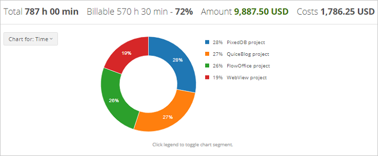
Projects and Tasks reports now include colorful donut charts that convey data from the report tables in a colorful and easy-to-read manner.

Since the last update of the product, very little time has passed. However, our team is constantly on the go to deliver functionality that matches our users’ specific needs.
In this release, we have implemented the following new features:
Interactive charts in app
Projects and Tasks reports now include colorful donut charts that convey data from the report tables in a colorful and easy-to-read manner. A graphic-related filter allows you to display specific data on a chart, such as billable time or billable amount relative proportions.

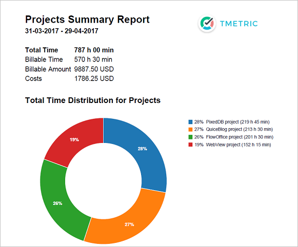
Exportable charts in PDF reports
Another nice improvement is that graphs will be included in PDF reports, so you can wow your clients with a visually pleasing and informative data representation.

Reports optimized
We have expanded the functionality in the Tasks and Detailed reports while removing the Daily report as redundant. Besides, we have changed the names of some reports to make it easier for users to identify the purpose of the reports.
Detailed report enhanced
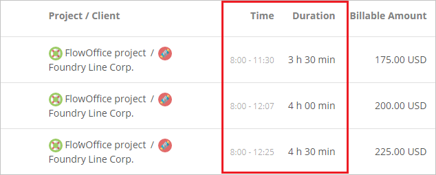
The Detailed report can be configured to show the start and end time of each separate time entry even if several time entries relate to one task. This option can be enabled in the Account settings.

Links and IDs in CSV reports
The CSV file of the exported Detailed and Tasks Summary reports now includes two extra columns: Issue Id and Link containing issue IDs and links to external tasks, correspondingly.


